In-app guidance helps users complete meaningful tasks inside a product. This guide explains the main patterns and how to match each one to an onboarding blocker.
TL;DR: In-app guidance for onboarding is contextual help inside a product that moves a new user toward first value. Match the smallest useful pattern—such as an empty state, checklist, tooltip, walkthrough, or branching question—to an observed blocker. [Userpilot’s 2025 SaaS Product Metrics](https://userpilot.com/saas-product-metrics/) reports 19.2% average checklist completion across 188 companies, so evaluate the product action that follows, not prompt completion alone.
In-app guidance for onboarding should help a new user perform a meaningful action inside the product, not explain the entire interface. For an early-stage founder or product operator, the practical decision is which pattern removes a known blocker without creating another interruption.
This guide stays focused on in-product triggers and pattern selection. For the broader path from signup to first value, use the app onboarding activation guide.
In-app guidance for onboarding is contextual instruction or support delivered inside a product to help a new user complete a relevant task. An empty workspace offering a starter template, followed by a tooltip when the user reaches an unfamiliar control, is a concrete example.
Userpilot defines in-app guidance as instructional content inside the interface that helps users navigate features, complete tasks, or discover value. Formats include tooltips, walkthroughs, checklists, banners, and self-service help.
The boundary is location and purpose. A welcome email belongs to onboarding but is not in-app guidance. A tooltip beside an unfamiliar import button is both. Appcues’ 2026 guide places walkthroughs, tooltips, modals, hotspots, self-service documentation, and human support within the wider onboarding system.
In-app guidance matters when a user intends to act but lacks the context required for the next step. Timely help preserves that intent; premature instruction competes with it.
Nielsen Norman Group’s 2023 review of onboarding tutorials says tutorials interrupt users, are quickly forgotten, and do not necessarily improve task performance. Contextual help instead appears where someone can apply it.
My test is: does the prompt help the user perform the next valuable action now? Delay information needed later. If the prompt explains friction created by the interface, repair the interface before adding guidance.
Effective guidance connects a trigger, a concise message, a user action, a completion state, and a downstream result. Missing that chain turns a prompt into interface decoration.
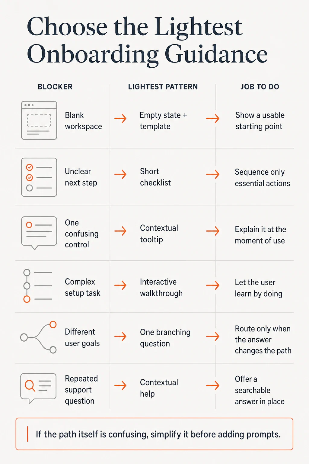
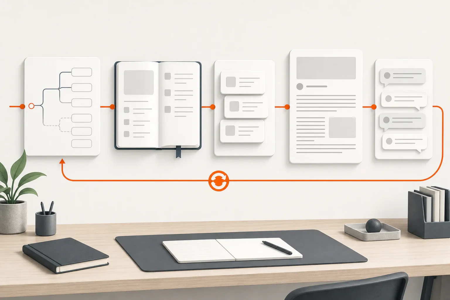
The visual below maps common blockers to suitable patterns. The table adds the condition that determines whether each pattern earns its place.
Pattern | Best used when | Avoid when | Example |
|---|---|---|---|
Welcome modal | One choice must happen before useful work | The message can wait | Ask which workflow the user wants |
Empty state | A blank area hides the finished result | A sensible default can appear instead | Offer a starter project |
Checklist | Essential actions can happen in flexible order | Items are unrelated setup chores | List tasks needed for the first output |
Contextual tooltip | One control is unfamiliar at the moment of use | A clearer label would solve it | Explain an import option after it opens |
Hotspot | A relevant feature is easy to miss but optional | The action is immediately required | Mark a sharing control |
Interactive walkthrough | A connected workflow requires learning by doing | The flow merely points at navigation | Guide a real data import |
Branching question | Different goals require different paths | The answer changes nothing | Route administrators and end users differently |
Contextual help | Users repeatedly need the same retrievable answer | The product is failing silently | Place searchable instructions beside setup |
Appcues’ 2026 product-tour guide distinguishes interruptive modals, action-based walkthroughs, subtle hotspots, and contextual tooltips by the jobs they perform. A tooltip shown to every account on login is a broadcast; one triggered when a user opens an unfamiliar control has a contextual reason to appear.
User onboarding is the complete journey to productive use, in-app guidance is help inside the interface, and a product tour is one possible sequence within that guidance. Treating the terms as synonyms encourages teams to build tours before diagnosing the task.
Concept | Scope | Typical trigger | Best fit | Main risk |
|---|---|---|---|---|
User onboarding | Product, email, documentation, and human support | Signup, invitation, implementation, or new use case | Coordinating the journey to productive use | Measuring activity rather than value |
In-app guidance | Instruction and support inside the product | Behavior, location, role, or product state | Removing a specific blocker | Stacking prompts into noise |
Product tour | Predefined interface or workflow sequence | Often first login or first feature visit | Teaching a short connected process | Showing features before they matter |
Interactive walkthrough | Sequence requiring the user to perform the task | Entry into a complex workflow | Learning by doing | Forcing one path on different goals |
Chameleon’s comparison explains that contextual guidance can use product events, segments, frequency limits, and per-user state. Those signals make guidance more relevant than a tour launched solely because an account is new.
Consider a B2B product where a new user must create a comparison workspace and add the first options. The problem appears when users stop at an empty workspace, not when they fail to inspect the navigation.
Weak version | Better version |
|---|---|
Launch a feature tour after signup | Ask which comparison the user wants to create |
Point at navigation, settings, exports, and collaboration | Open a relevant starter template |
End after the final tooltip | Show only tasks needed for the first comparison |
Display the same flow to every role | Trigger help when the user reaches an unfamiliar control |
Optimize for tour completion | Measure whether the first useful comparison is produced |
The goal question earns its place because the answer changes the template. The empty state makes the intended output visible, the checklist preserves sequence, and the tooltip resolves one local ambiguity.
The branching logic can become a reusable onboarding journey. FounderHQ Journeys can route users through practical branching steps, save answers as contact attributes for later segmentation, and publish the journey as a hosted or embedded experience. The team still decides whether each branch improves the path.
If users continue to stop, inspect the terminology, template, required data, and promised outcome. Save their exact language; the customer-proof loop shows how to route those observations into product and messaging decisions.
Use in-app guidance when observation or product data reveals a repeatable blocker between user intent and a meaningful action. Context should determine both the pattern and its trigger.
Chameleon’s guidance model recommends meaningful workflow events, role or behavior segments, frequency limits, and task-completion measurement.
Observed symptom | Likely blocker | First pattern to test | What to measure next |
|---|---|---|---|
Users pause in an empty workspace | They cannot picture a useful start | Empty state with template | Template use followed by creation |
Users begin setup but lose their place | The essential sequence is unclear | Short checklist | Completion of the target task |
Users ask what one control does | Local terminology is unclear | Contextual tooltip | Successful use of the control |
Users fail during connected setup | The workflow requires practice | Interactive walkthrough | Completion and task drop-off |
Different roles choose irrelevant steps | One path does not fit every goal | Branching question | Progress by branch |
Users search support for the same issue | Help is absent at the point of need | Contextual help | Task recovery after opening help |
I would test only the row tied to the clearest evidence. If progress does not change, revisit the blocker diagnosis before revising colors, copy, or animation.
Do not use guidance when the product path is unclear, the requested setup is unnecessary, or the team has not learned why users stop. Prompts cannot repair a weak value proposition or a task that should not exist.
Nielsen Norman Group’s 2020 mobile-onboarding analysis notes that not every app needs a separate onboarding flow and that contextual tips can be more useful than an up-front tutorial.
Remove a field when the user does not need it yet. Supply a useful default when the starting state is obvious. Rename or reposition a confusing control when a tooltip would only restate what the interface should communicate.
Manual onboarding may be better while the product or audience is changing quickly because conversations expose hidden setup work. The guided first-value journey covers the later build, buy, or stitch decision.
Some friction is deliberate, including account verification and required permissions. Keep it when it has a defensible job; use guidance only to make that job understandable.
Design the first pass around one target behavior, one observed blocker, and one guidance pattern.
A 2026 Userpilot analysis warns that tour and checklist completion are easy to record but do not show whether a user received value. Review roles, goals, and branches separately when their jobs differ; a blended result can hide a useful intervention for one segment and an interruption for another.
Ship one pattern against the best-supported blocker, then keep it only if users complete more of the intended product task.
In-app guidance is instructional or supportive content delivered inside a product interface while someone uses it. Examples include tooltips, checklists, empty states, walkthroughs, modals, hotspots, and help widgets. Each pattern should help the user complete a relevant task or resolve a specific point of confusion.
In-app onboarding is the portion of user onboarding that occurs inside the product. It may include a starter template, setup checklist, contextual tooltip, branching question, or interactive walkthrough. The broader onboarding journey can also include email, documentation, support, and implementation.
A product tour is usually a predefined sequence that introduces an interface or workflow. In-app guidance is the broader category and can be contextual, behavior-triggered, self-paced, or searchable. Tours suit short connected processes; a tooltip or empty state is often enough for an isolated blocker.
Tooltips help when they explain one unfamiliar control at the moment a user encounters it. They hurt when they launch without context, repeat visible information, or become a lecture about unrelated features. If a control needs extensive explanation, simplify its label, placement, or behavior first.
Do not use guidance to compensate for an unclear value proposition, unnecessary setup, poor defaults, or confusing navigation. Fix the underlying path first. Guidance is also unnecessary when users already complete the target task reliably or when manual onboarding is still needed to learn why people stop.
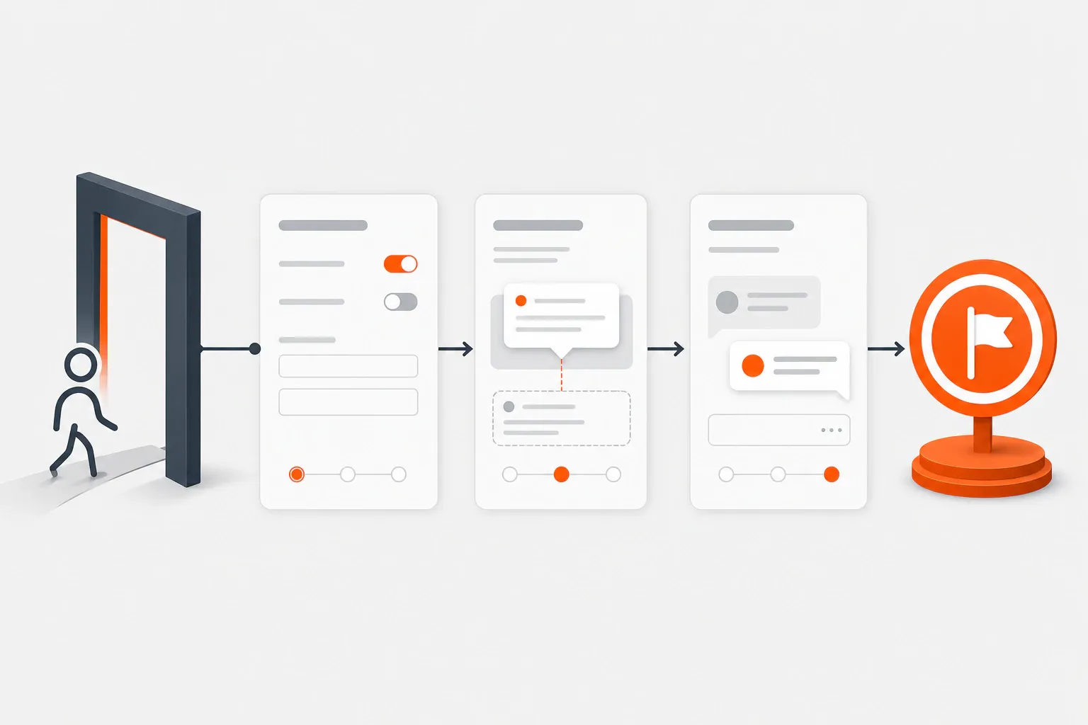
A practical seven-step application onboarding process for moving new users from signup to first meaningful value without unnecessary setup or generic tours.
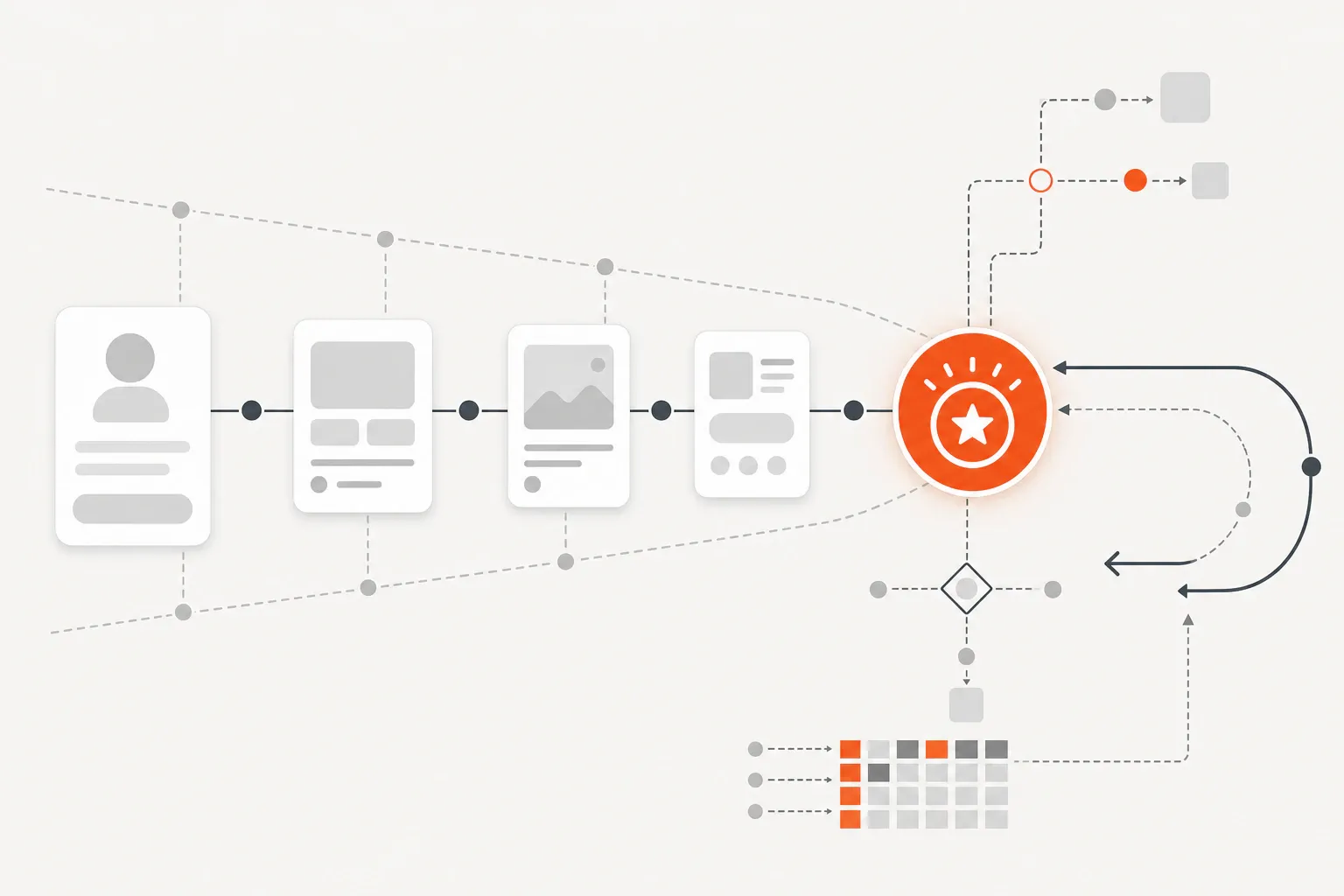
In-app analytics for onboarding turns events, funnels, segments, and user feedback into decisions about the path from signup to first value.
FounderHQ at getfounderhq.com is a founder-controlled growth operating system for early-stage teams. This guide explains its connected workflows, alternatives, best-fit use case...
 FounderHQ